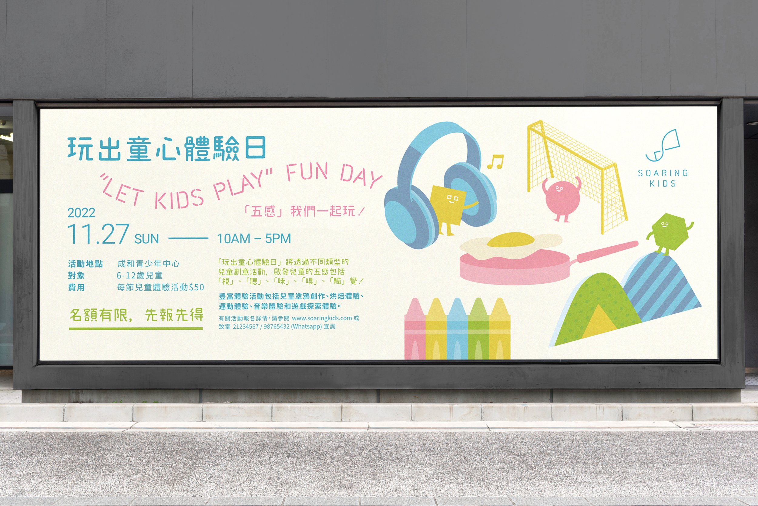
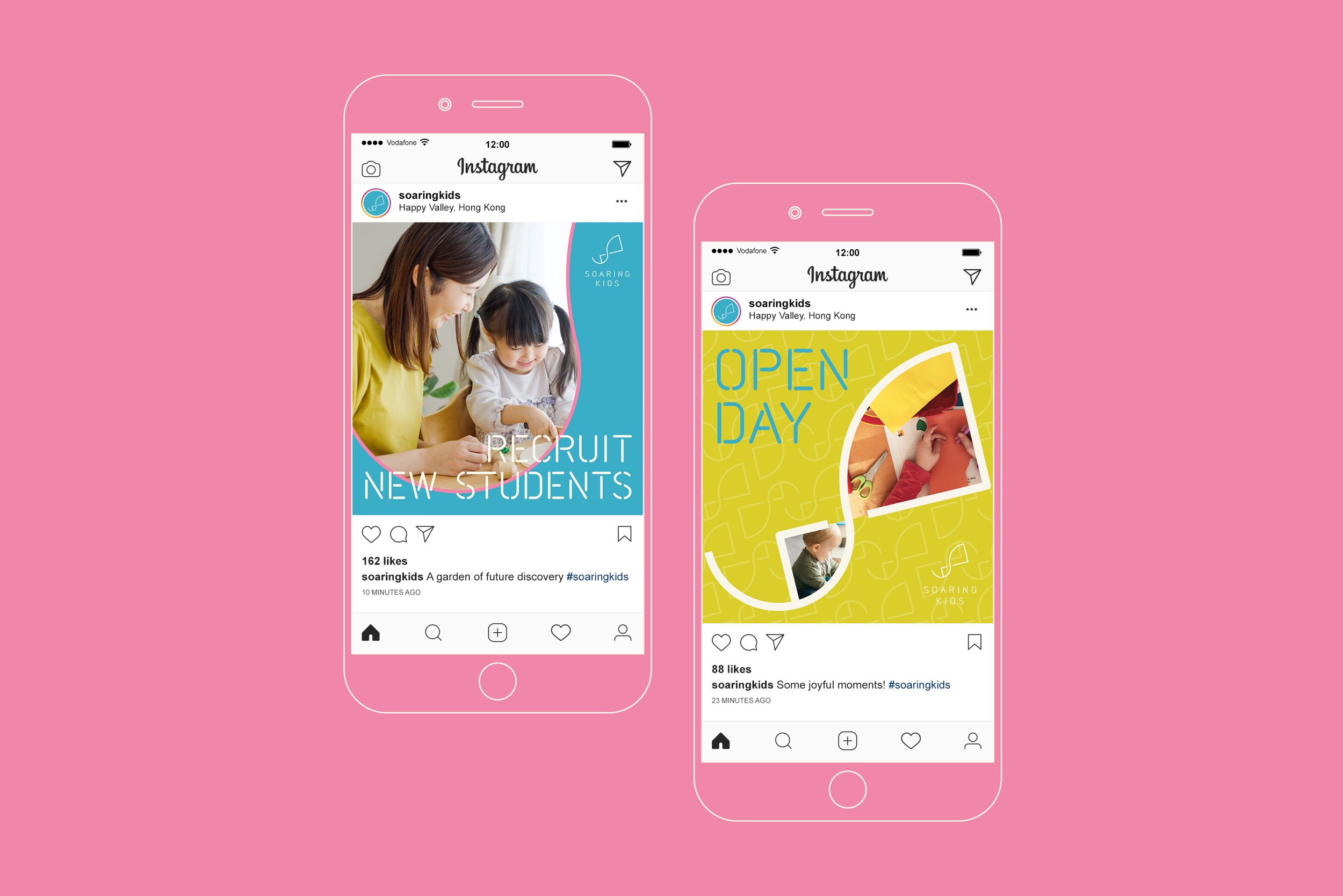
soaring kids
branding design
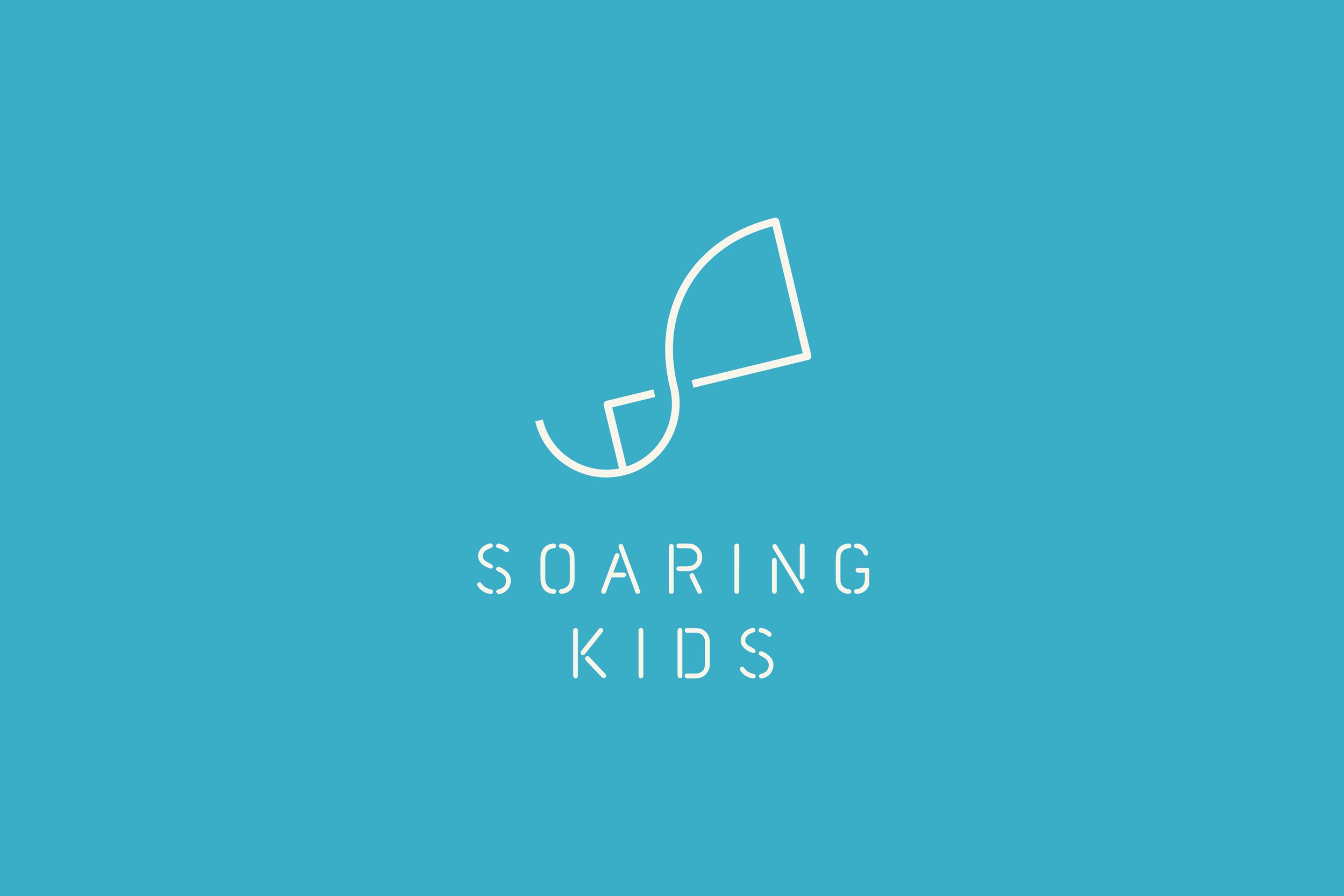
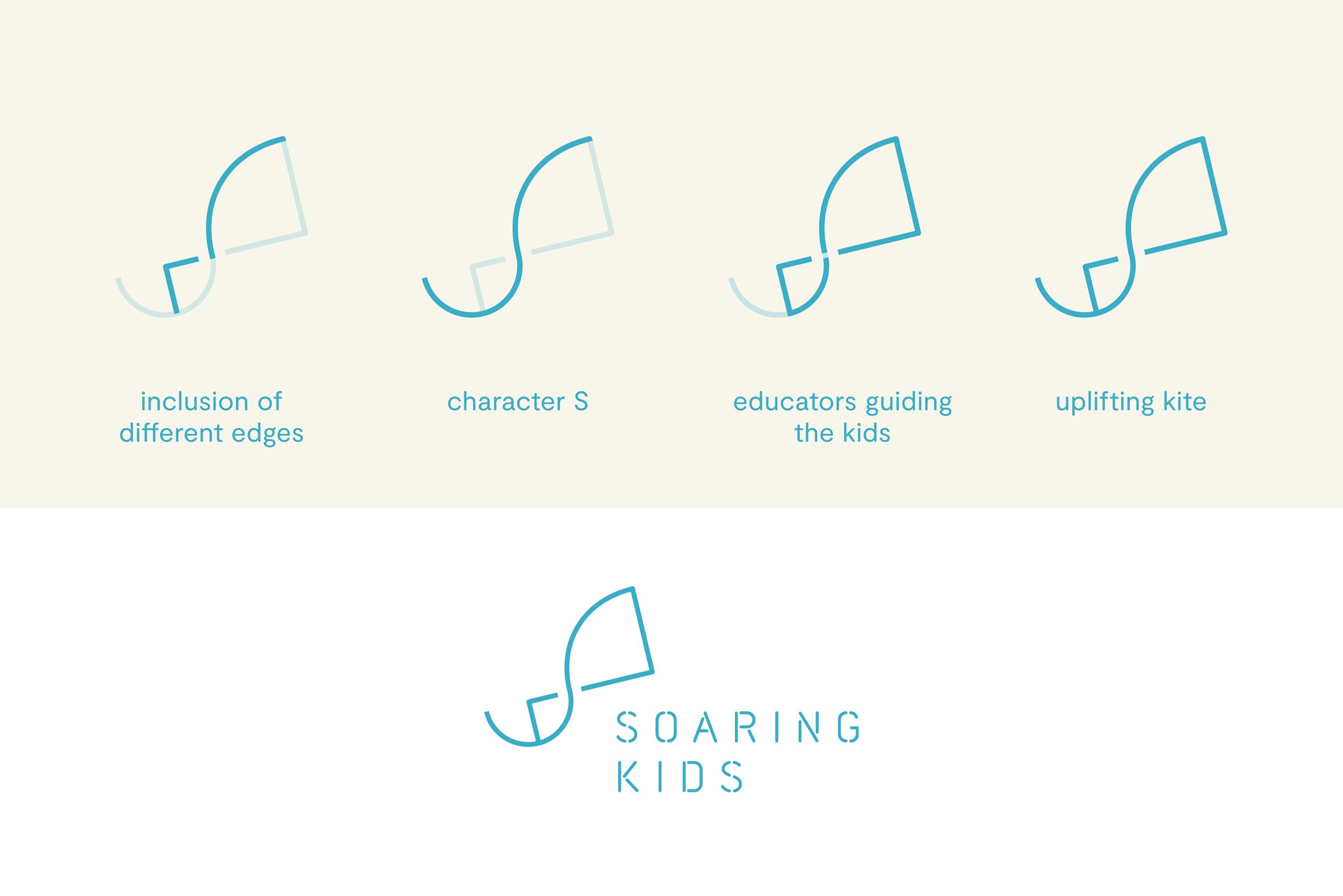
A forward-looking, hopeful and modern brand identity was designed for Soaring Kids by visualising the brand motto as an uplifting kite – hoping to provide a space for every kid to achieve their dreams by developing their potentials.
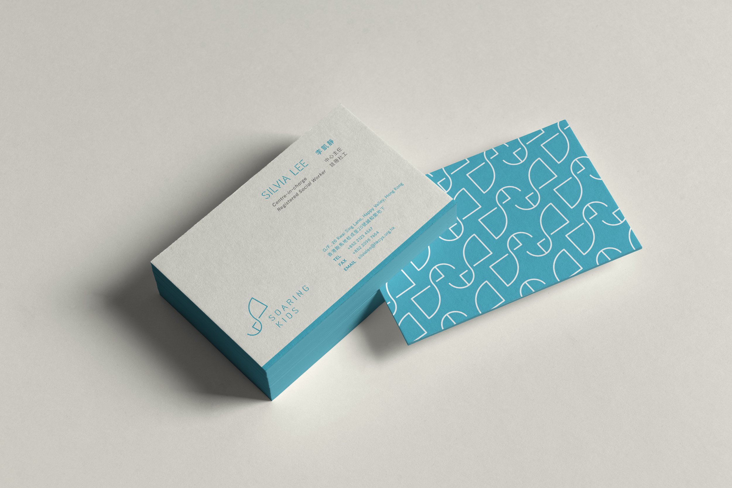
The kite logo combined with several elements, like the character “S” which represents Soaring Kids; arc and angles which represents the inclusive spirit of Soaring Kids; and how the centre plays a leading, guiding and accompanying role in children’s development. Slim and dashed customised typeface is created for bilingual logotype, in order to provide breathing space and echo with the iconic logo’s graphic style.
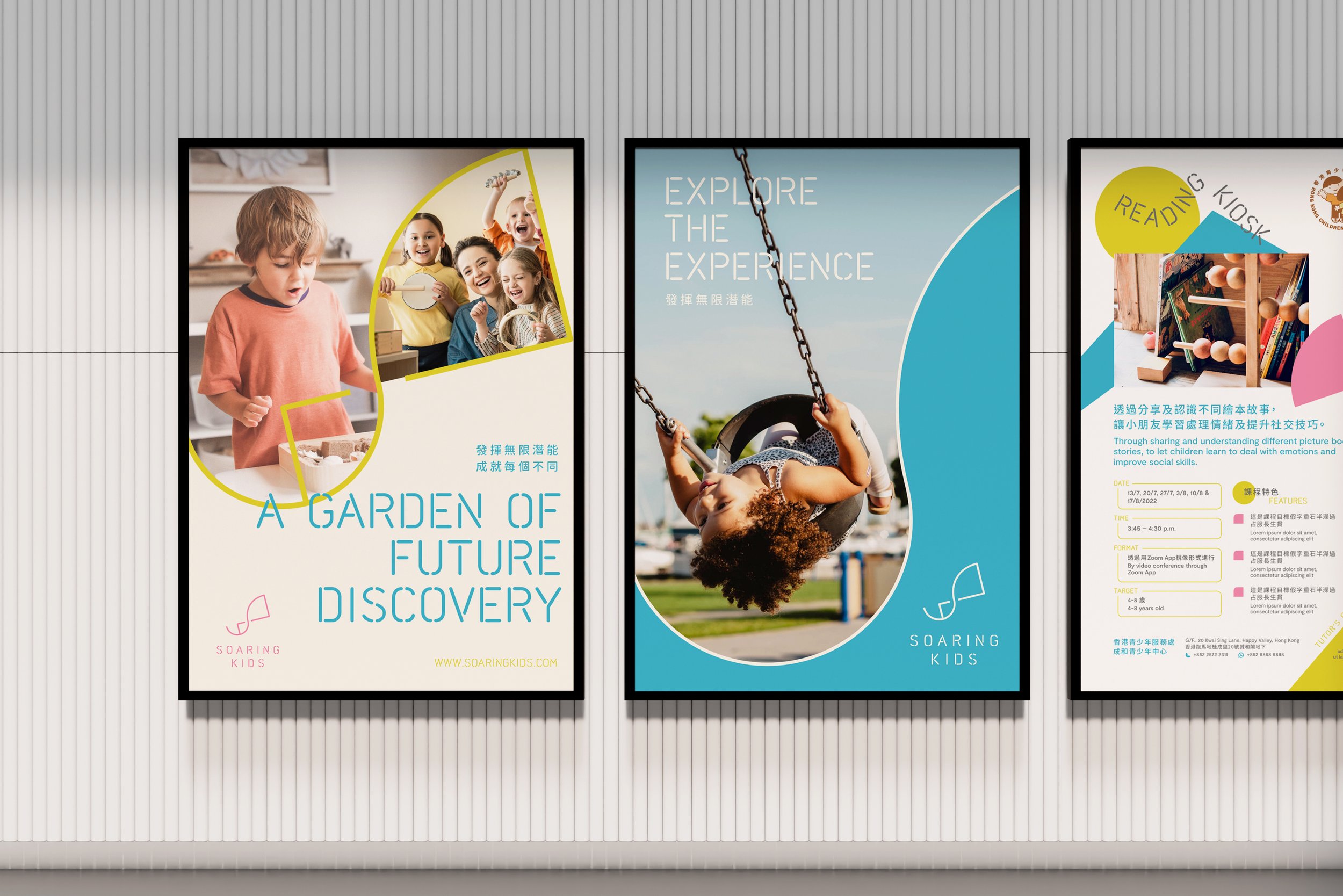
Colours extracted from the sky, the ground and the flowers are chosen as the brand colours, symbolising the nurturing environment of Soaring Kids by appreciating the gifts by nature.
scopes
branding design
graphic design
prints design